Some people taste Napa Valley before the cork is pulled.
They notice it on the shelf. The weight of the bottle in the hand. The texture of the paper. The confidence of a label that does not rush to explain itself. Long before the wine is poured, design has already shaped expectation.
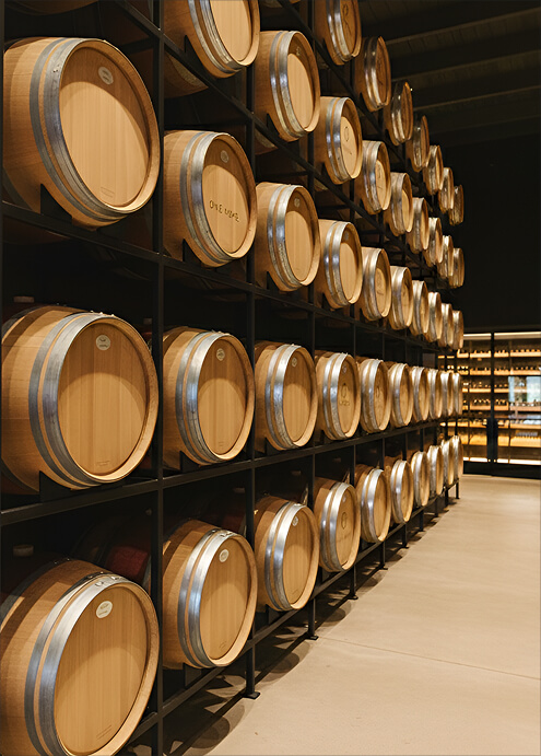
If you are drawn to wine labels, packaging, and brand design, Napa reveals a quieter layer of itself. One that lives at the intersection of agriculture, hospitality, and storytelling. Here, design is not decoration. It is a signal of intent that often mirrors the land it comes from.
What This Experience Is Really About
Wine design in Napa is about alignment.
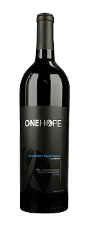
The strongest labels whisper rather than shout. Paper stock, negative space, bottle shape, and capsule choice all reveal how a producer sees their role in the valley.
Material honesty matters. Consistency across a lineup matters. Design here often mirrors geography. Structured where vineyards are disciplined, like the Rutherford benchlands. Softer where hospitality and gathering lead.
For people who care about brand systems, Napa becomes a living case study.
When It Is Best
Design focused visits work best when the valley is calm.
Winter and early spring allow for deeper conversations about evolution and intent. Midweek remains essential. Tuesday through Thursday offers space to notice details and ask better questions.
Late morning is ideal. Palates and minds are fresh, and the experience is less hurried.
What Most Visitors Miss
Many visitors assume bold design equals quality or that minimalism always signals prestige.
In Napa, confident producers often choose restraint. Others use expressive design to signal warmth and approachability rather than hierarchy.
Another miss is separating packaging from hospitality. In Napa, the way a bottle feels in your hand often reflects how a winery will host you. Calm labels usually lead to calm experiences.
My Local Notes
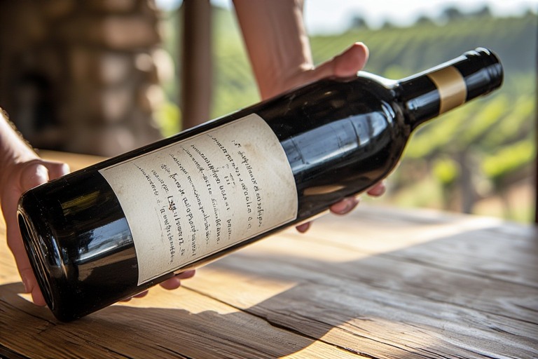
I always suggest holding the bottle before tasting. Feel the weight. Notice the paper. Ask yourself if it feels considered or performative.
Look at consistency across vintages and varietals. Strong brands think in systems, not one off statements.
If the label feels grounded, the experience usually is too.
A Short Personal Story
Years ago, I stood in a cellar holding a bottle that said almost nothing. No tasting notes. No explanation. Just space and intention.
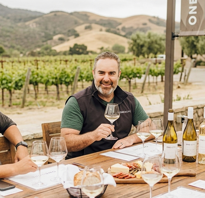
That moment stayed with me. It shaped how we thought about design at ONEHOPE and how we approached packaging at Estate 8. The goal was never to impress at first glance, but to feel honest in the hand and familiar over time. Like a handshake that does not need to linger to feel sincere.
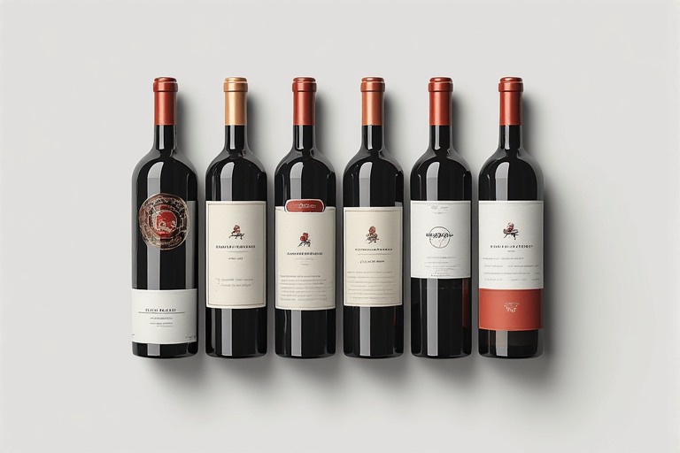
How to Read a Napa Wine Label
Start with what is emphasized. Is it place, variety, or producer.
Notice the materials. Heavy glass can suggest aging intent. Lighter bottles may signal everyday drinkability or environmental awareness.
Pay attention to small choices like capsule and cork. These details often reveal how and when a wine is meant to be enjoyed.
Ask why decisions were made. Good wineries can explain design as clearly as farming.
If You Only Have One Design Focused Visit
Choose an estate where the hospitality team is closely tied to the brand story. Ask how the label has evolved and what feedback they listen to.
Design reveals itself best through conversation.
Small Histories
Early Napa labels were practical and understated. As the valley gained recognition, design became more expressive. Today, many producers are returning to restraint, material honesty, and quiet confidence.
Design here often follows maturity.
Gentle Note From Home
I will admit a small bias. At ONEHOPE and Estate 8, design matters deeply to us. Not as marketing, but as an extension of hospitality. The bottle is often the first handshake. It should feel considered, sincere, and grounded in place.