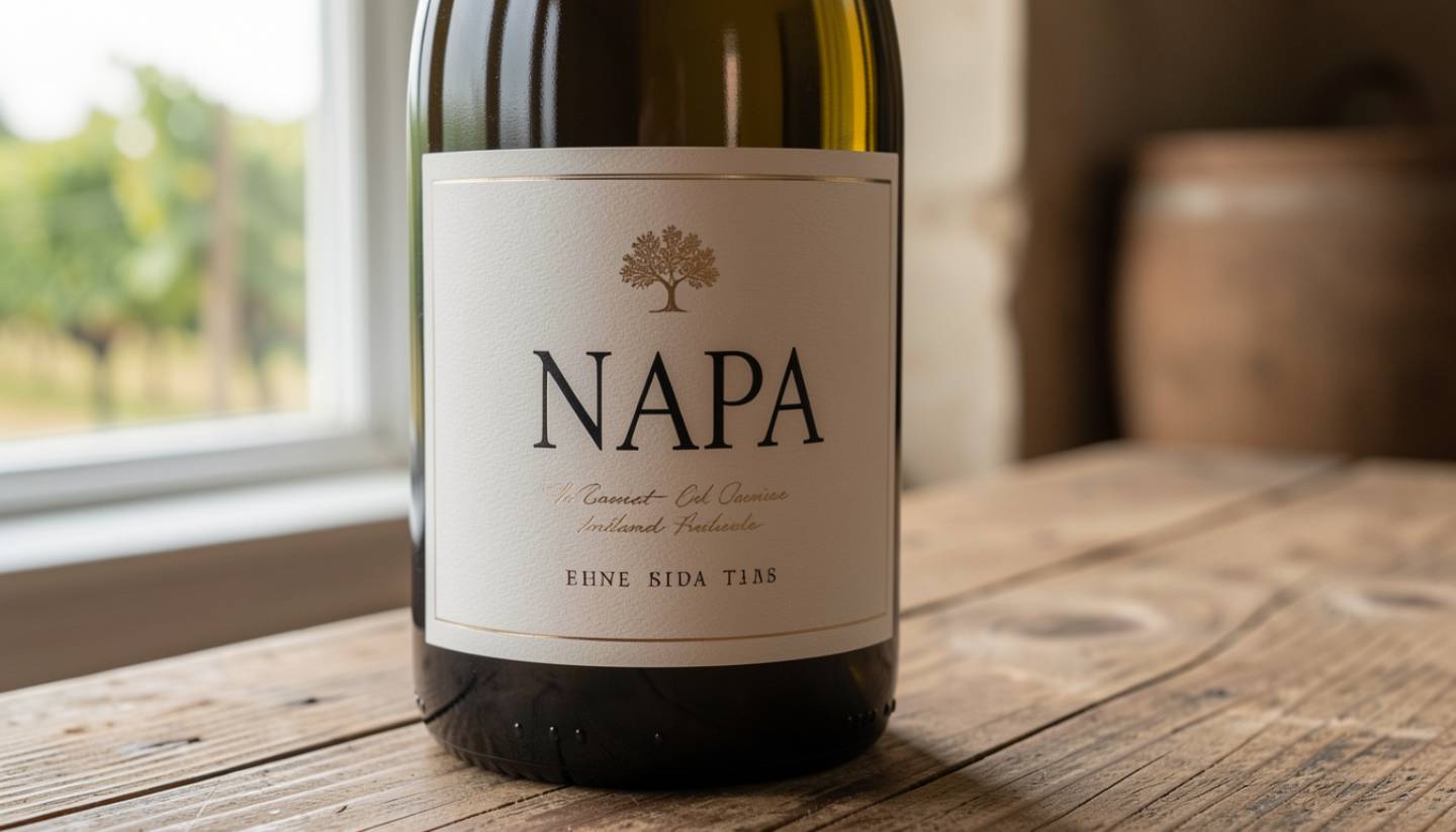
There is a moment in Napa Valley when you realize the label matters almost as much as what is inside the bottle. It happens quietly. Standing in a calm tasting room. Feeling the texture of the paper between your fingers. Noticing how typography, spacing, and restraint signal intent before the wine is even poured.
For travelers who love design, Napa feels less like a destination and more like a living gallery. Labels, architecture, vineyards, and light all speaking the same measured language of balance and place.
What This Experience Is Really About
This is not about flash or novelty. Napa design rewards restraint.
The most enduring labels here tend to share a few qualities:
Confidence without noise
Negative space used deliberately to signal trust.
Tactile intention
Paper stocks, embossing, and weight that feel purposeful in the hand.
Typography with memory
Fonts that reference history, geography, or philosophy rather than trends.
In Napa, the best design never competes with the wine. It prepares you for it.
When It Is Best
Midweek year round
Tuesday through Thursday is the slower, truer Napa. Hosts have time to talk. Details have room to breathe.
Late winter and early spring
Softer light, fewer crowds, and a reflective pace make it easier to notice architecture and label nuance.
Late afternoons
As the light shifts along the Mayacamas, labels and spaces reveal their geometry and proportion.

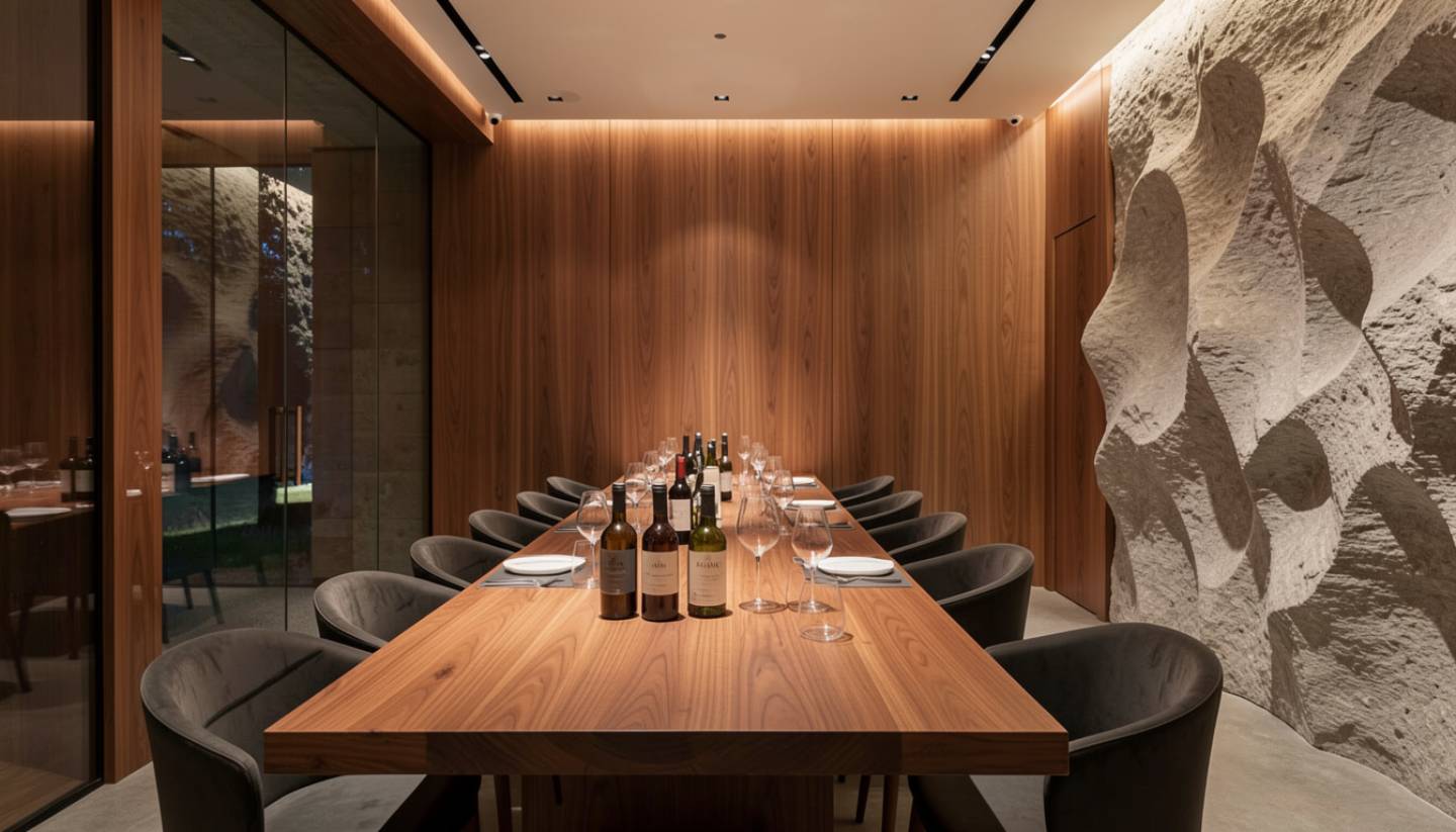
Where Design Shows Up in Napa
Design in Napa is never isolated to the bottle.
You see it in:
- The way tasting rooms frame vineyard views
- How menus, signage, and cellar doors share a visual language
- Labels that reference geographic anchors like the Rutherford benchlands or Silverado Trail
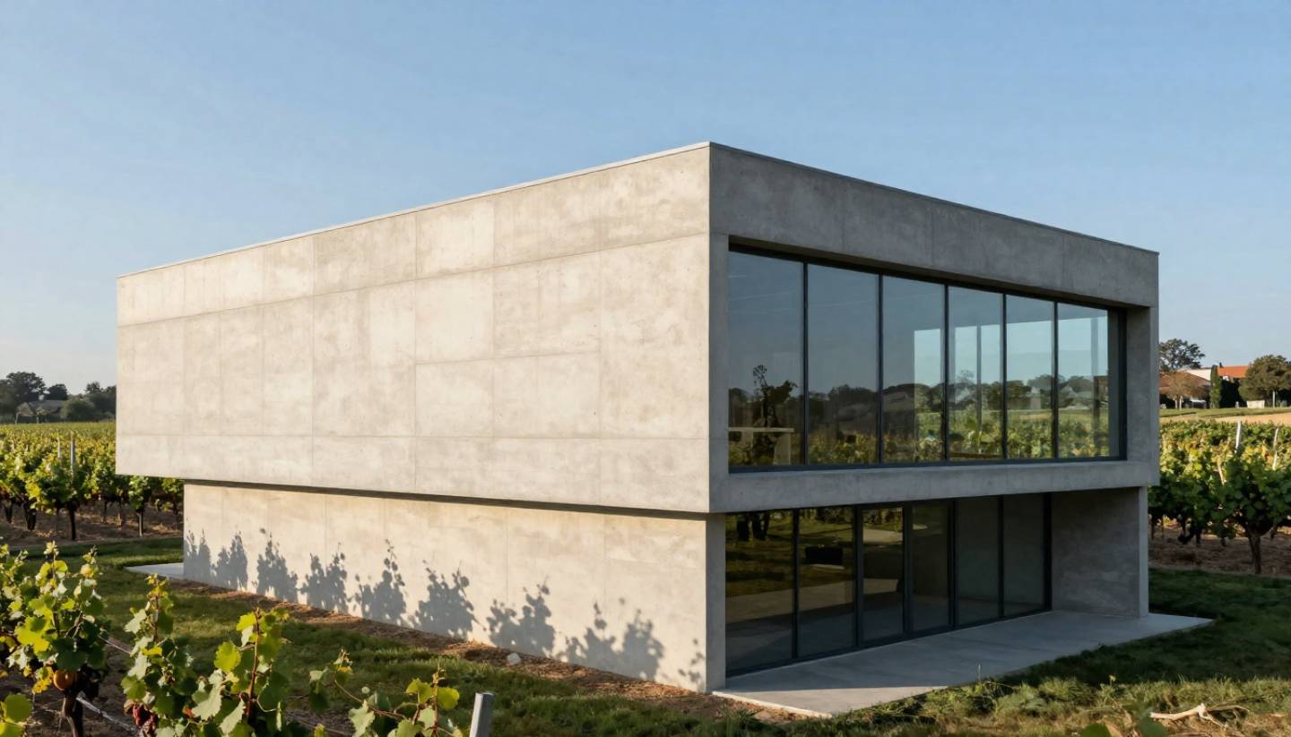
- Architecture that feels carved into the land rather than placed on top of it
The strongest estates think holistically. Wine, place, and design are one conversation.
Wineries Worth Visiting for Design-Focused Travelers
Inglenook
Just off Highway 29, Inglenook is a masterclass in timeless design. Historic typography, stone architecture, and visual consistency that has never chased trends.
Hall Wines
Bold contemporary art and modern labels paired with high-contrast architecture. The Bunny sculpture has become a quiet local landmark.
Opus One
Minimalism at scale. The label and the subterranean estate reflect symmetry, proportion, and confidence without excess.
Artesa Winery
Five minutes south of the main valley, this estate uses architecture to shape perception. You feel the design before you taste the wine.
Schramsberg Vineyards
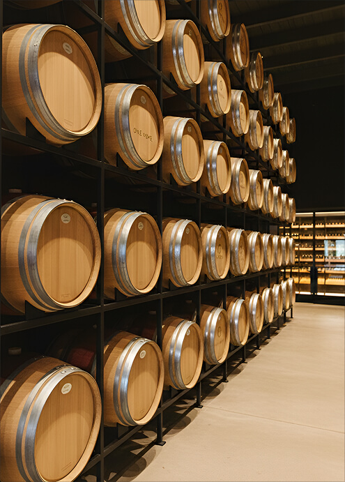
Classic labels and nineteenth-century caves. A reminder that legacy design does not need to announce itself.
What Most Visitors Miss
Most people glance at a label and move on.
Design-focused travelers slow down and ask different questions:
- Why does this label avoid imagery entirely
- How does fog, elevation, or soil show up in the color palette
- Why has this look remained unchanged for decades
In Napa, consistency is often the strongest design signal.
My Local Notes
I still remember the first time a label slowed me down before the cork was pulled. The paper was heavier. The typography quieter. I found myself paying more attention without knowing why.
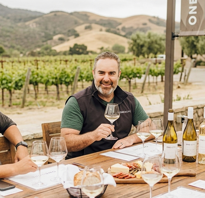
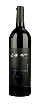
When we were developing Estate 8, that lesson stayed close. Every design decision came back to one question. Does this feel like it belongs to the land. ONEHOPE grew from the same instinct. Design should support meaning, not compete with it. I am admittedly biased. Estate 8 is my purpose-driven baby. But the labels people keep the longest are usually the ones that never tried too hard to be remembered.
A Gentle Design-Focused Itinerary
Day One
Arrive in downtown Napa. Visit CIA at Copia for food-driven design inspiration. End the day at Artesa for architecture and light.
Day Two
Contrast a classic like Inglenook with a contemporary stop at Hall. Lunch at Charter Oak, where materials and restraint define the room.
Day Three
Visit a hillside producer. Notice how elevation and terrain often translate into more textured, rugged label choices.
Where to Eat if You Love Design
Design-minded travelers gravitate toward spaces where material choices matter:
- Rooms with natural light and edited menus
- Restaurants that feel intentional rather than decorative
- Spaces where age improves character
The meal should feel as considered as the label.